Beverage Packaging Design: A Practical Shelf Appeal Framework
What makes beverage packaging stand out is the sum of clear visual hierarchy, functional fit-for-use, and an authentic brand story expressed in materials and finish. Effective beverage packaging design balances immediate visibility with truthful product cues so shoppers can scan, understand, and choose within seconds. This guide presents a practical shelf-appeal framework to evaluate packaging choices and decide which tradeoffs make sense for retail performance, production, and the customer experience.
How the shelf-appeal framework answers "What makes beverage packaging stand out?"
Before selecting materials or printing techniques, decide which shelf behaviors matter for the brand: is the product discovered by color, shape, premium finish, or clear product visibility? The beverage packaging design decision should start with that business question because every manufacturing choice supports one or more shelf behaviors. The framework below groups the most influential factors into five pillars and links each to practical decisions.
1. Visibility: signal that captures attention
Visibility is how well a package interrupts a shopper’s visual flow. Consider bold color contrast, distinctive silhouettes, and large, legible brand marks. For bottled beverages, silhouette and necklines read at a glance. For boxed or carton presentations, face panels with a single focal graphic tend to outperform cluttered layouts. Visibility choices influence shelf placement, fixture type, and overall merchandising strategies.
2. Clarity: communicate the product quickly
Shoppers decide in seconds. Label hierarchy should prioritize product type, flavor, size, and nutritional or usage claims in that order for most beverage categories. Avoid decorative type that obscures basic product cues. Clear labeling reduces purchase friction and supports repeat purchase when the same brand appears across a broader range of SKUs.
3. Differentiation: stand apart without confusing the customer
Differentiation uses unexpected finishes, tactile elements, or structural design to create a memorable moment. Embossing, selective matte and gloss contrasts, or a reusable bottle cap can create perceived value. Differentiation should never obscure clarity or negate production feasibility. For many brands, subtle cues that reward hold-and-look behavior perform better than loud, noisy graphics that fatigue the eye.
4. Functionality: protect, dispense, and encourage repeat use
Functionality covers protection during transport, shelf stability, and user interaction at pour, pour-back, or reseal. Choices such as thicker glass for still beverages, tamper-evident seals for juices, or sport caps for on-the-go drinks affect shelf presence and logistics. Packaging must balance retail appeal with ergonomic realities and legal requirements for food and beverage containers.
5. Material perception and sustainability cues
Material choices influence both perception and supply-chain considerations. Recyclable cartons, lightweight glass alternatives, and PCR label stocks can communicate environmental intent, but sustainability claims require accurate supporting actions. Material selection affects print options, finishing, and the overall tactile impression that shoppers associate with quality.
Translating the framework into format decisions for bottles, cans, and retail packaging
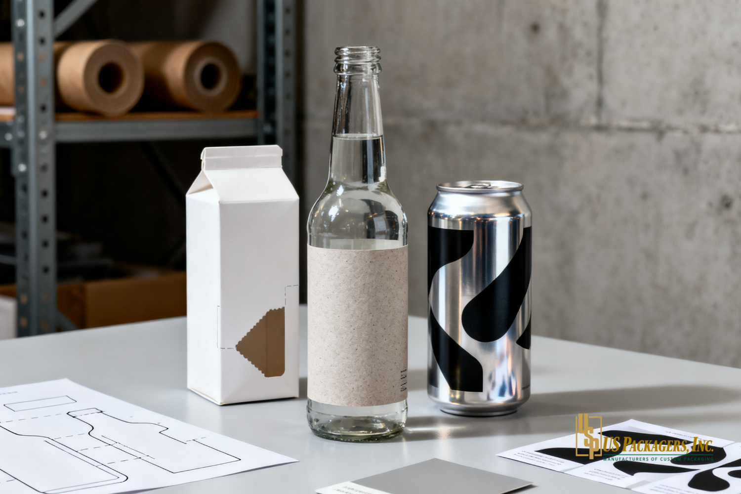
Applying the framework begins by matching product format to shopper behavior and distribution channels. Branded bottles may rely on silhouette and finish, while cans compete on color and decal legibility. Shelf configurations—gondola, cooler door, pallet display—change how packaging reads and what design elements are visible from 1 to 3 meters away. When planning format choices, include merchandising constraints and the retail environment in early design discussions. For specialized support with format, sizing, and compliance, consult Packaging Capabilities to align design intent with manufacturing options.
Branded bottles
Branded bottles create opportunities for structural differentiation: unique shoulder shapes, textured glass, or integrated handles. Consider how labels interact with glass—shrink sleeves allow full-wrap imagery, but pressure-sensitive labels offer matte or soft-touch finishes that invite handling. Decide whether the bottle should read as premium on shelf or as everyday value; the choice determines material thickness, finish, and label strategy.
Cans and single-serve formats
Cans rely on color, contrast, and concise typography. Because surface area is limited, prioritize a single visual focal point and keep essential product information grouped and legible. For multipack retail packaging, the outer carton becomes the primary brand canvas; design both inner and outer layers to work together visually.
Retail packaging and displays
Retail packaging extends the brand story beyond the primary container. Point-of-purchase displays, shelf-ready cartons, and secondary pack design affect how quickly consumers notice and understand the product. Packaging that optimizes shelf facings and minimizes wasted shelf footprint can increase effective visibility.
Material, printing, and finishing choices that influence perception and performance
Once format and messaging priorities are set, choose materials and finishes that support them. Printing method, varnish selection, and label placement all change how a design reads under store lighting and on a crowded shelf. Select options that are reproducible at scale and compatible with filling lines and logistics.
Print fidelity: High-resolution artwork produces crisp typography and accurate color reproduction, which preserves visibility at distance.
Finishes: Matte versus gloss alters perceived price point; spot gloss highlights specific graphics while soft-touch coatings invite handling.
Label systems: Pressure-sensitive labels, shrink sleeves, and direct printing each offer different opportunities for full-bleed graphics, tactile effects, and recyclability.
Structural add-ons: Resealable closures, tamper bands, and pour spouts should be evaluated for cost, convenience, and impact on shelf presentation.
How to evaluate packaging on the shelf: a practical checklist
When deciding between design options, use this quick evaluation to compare concepts objectively.
Distance test: Does the primary brand element read clearly from 2–3 meters away?
Category fit: Does the package use familiar cues so shoppers understand the product quickly?
Contrast check: Are the most important elements visually prioritized with color or finish?
Shelf simulation: How does the design perform in a crowded mockup or a cooler door?
Handling test: Does the material and finish invite inspection without appearing fragile?
Logistics review: Can the chosen materials survive packing, shipping, and retail handling?
Regulatory and labeling compliance: Are nutrition, UPC, and legal marks placed correctly and legibly?
Businesses looking for additional packaging insights can also read Food & Beverage Packaging for more practical guidance.
Common questions brands should ask before committing to a final design
Choosing packaging requires input from marketing, operations, and supply chain. The questions below help surface tradeoffs early and keep the launch path realistic.
Which retail fixtures and shelf types are most common for the category?
What are acceptable weight and dimensional limits for shipping and shelf placement?
How will the packaging perform under retail lighting and in chilled environments?
Which finishes add meaningful perceived value relative to their incremental cost?
Are sustainability claims backed by recyclability or verified material content?
Frequently asked questions
What single design change most improves shelf appeal?
Answer: Improve signal-to-noise. Simplifying the primary visual cue—brand mark, color block, or window—so it reads from a distance typically yields the largest immediate uplift. Complex decorations can be added secondarily if clarity is secured first.
How important is package shape versus graphics?
Answer: Both matter, but their impact depends on category. In categories with many similar cans or bottles, a distinct shape can create long-term recognition. In fast-rotation refrigerated fixtures, bold graphics often win because shape is less visible on narrow shelves.
Can premium finishes work at scale for mid-market brands?
Answer: Yes, but only when finish choices are aligned with production methods that remain cost-effective at target volumes. Consider localized application of premium treatments to key SKUs rather than across an entire line.
How should smaller brands test shelf performance affordably?
Answer: Use mockups and small-run prototypes to simulate real shelf conditions, including cooler and gondola displays. Observing shopper behavior in a controlled test is more instructive than relying solely on aesthetics in isolation.
Packaging Decisions that Balance Shelf Appeal, Production, and Brand Intent
At US Packagers, custom Food & Beverage Packaging solutions bridge the gap between design intent and manufacturable reality by aligning material choices, finish options, and structural design with the brand’s shelf strategy. For beverage brands seeking to improve visibility and convert shelf impressions into purchases, collaborative design review and early production feasibility checks help reduce costly revisions and preserve creative intent. Package Your Food & Beverage Brand to ensure packaging decisions reflect both retail realities and the customer experience.